New Branding
Announcing Our New Branding
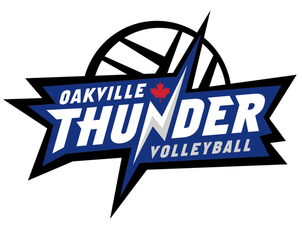
Big News! After over 2 decades as a volleyball club, Oakville Thunder has decided to revamp it’s logo! We are proud to announce the launch of the new logo as part of the ongoing evolution of the Oakville Thunder Volleyball Club.
Oakville Thunder Volleyball Club has grown and evolved over the last 21 years, and it is time for a change! We have rebranded with a new logo design to reflect who we are as a club today and to symbolize what Oakville Thunder hopes to continue to be in the future. The new logo evokes the boom, the boldness and the strength our club delivers. The colours are an exact match to our long-standing club branding, and the red maple leaf represents the Canadian pride. We can’t wait to see the new logo on our club gear being worn by our Oakville Thunder family!
In partnership with K Design Studio, Creative Director Kristine Verbeek has been an essential part and an amazing partner to work with in rebranding the Oakville Thunder Volleyball Club. After visualizing and researching what “Thunder” means to our athletes, families, and volunteers – we have come to decision around a final logo design and are ready to finally unveil it!